Food Service PLATFORM
Structuring a Bold and Accessible Food Evaluation Platform

Feedback Project
Feedback Project
Feedback Project
Feedback is a platform designed to connect food producers with professional food evaluators, offering essential feedback to help producers improve the quality of their food.
Timeline
5 months
Background
Feedback serves food producers and evaluators, enabling small-scale producers to access professional insights affordably. I contributed to UX design, UX writing, and client collaboration to align with their vision while ensuring usability and accessibility.
Challenge
Challenge
Challenge
Designing a platform that not only meets the needs of the target users but also aligns with the client’s vision of a bold, punk-inspired design style. We faced several hurdles along the way, including:
Additionally, we needed to create a website that served multiple personas while sticking to the "brutalist, punk, bold" design requested by the client.
Team
Dynamics
Team
Dynamics
Rotating team members and
long feedback loops,
especially with the holiday season.
Rotating team members and
long feedback loops,
especially with the holiday season.
Design
System
Design
System
Navigating the constraints of a design system that had its own set of rules.
Navigating the constraints of a design system that had its own set of rules.
Content Overload
Content Overload
Managing complex information in a way that didn’t overwhelm the user.
Managing complex information in a way that didn’t overwhelm the user.
Accessibility
Accessibility
Making sure the design was not only fun but also accessible to all users despite the client’s preference for bright, eye-catching colors and bold typography.
Making sure the design was not only fun but also accessible to all users despite the client’s preference for bright, eye-catching colors and bold typography.
Accessibility
Accessibility
Accessibility
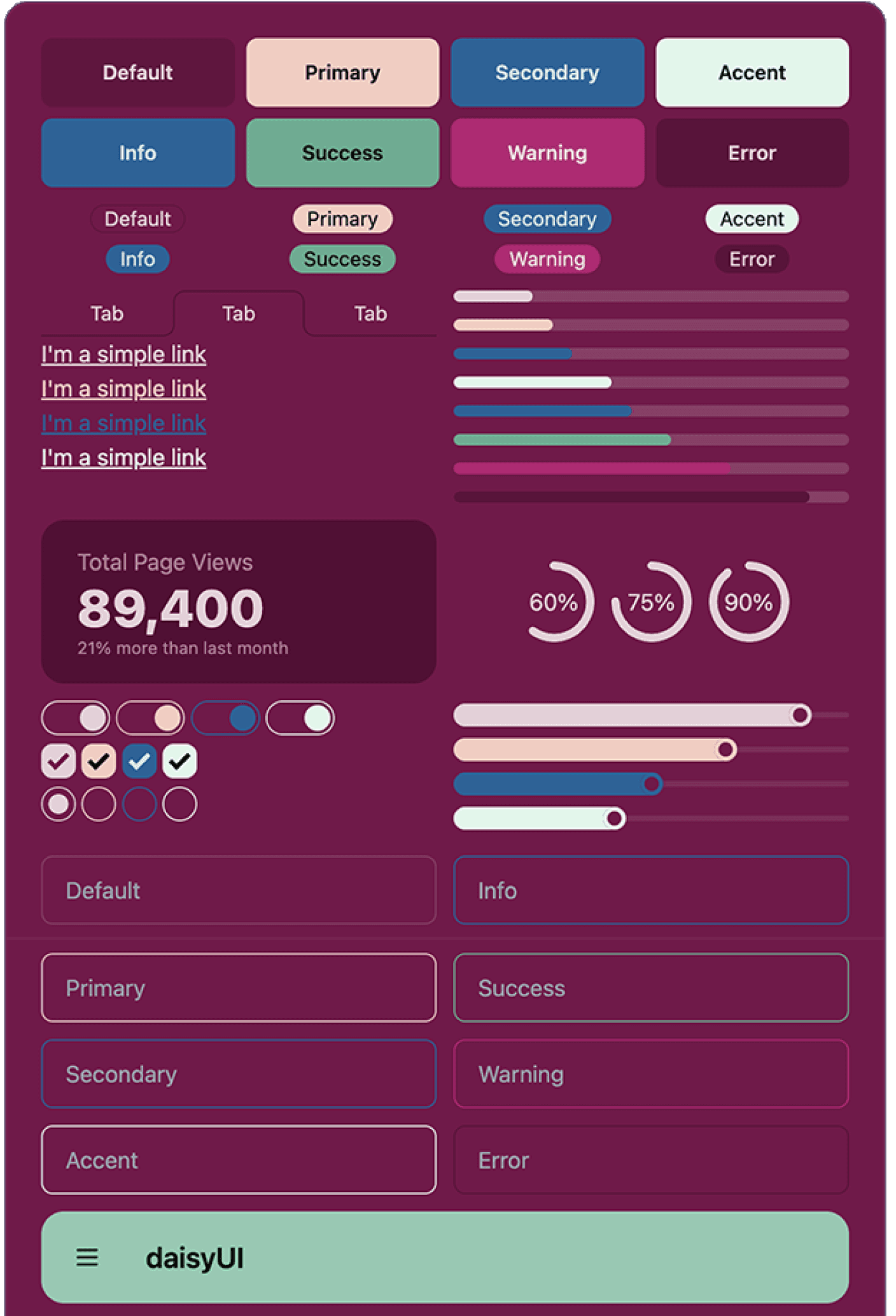
A key focus of this project was ensuring the bold, colorful design remained accessible.
To balance the client’s vision with usability, we integrated the Daisy UI design system and
adjusted colors for accessibility.
Color Contrast
We ensured high contrast between text and background to improve readability for users with low vision and color blindness.
Font Choices
Large, legible fonts like Roboto and Montserrat were used, with adjustable text size for visual impairments.
Accessibility Testing
We tested the design with color contrast checkers and screen reader tools to ensure all elements, including forms and buttons, were navigable.
Form UX Writing & Content Clarity
Form UX Writing & Content Clarity
Beyond visual accessibility, We improved content clarity in forms to ensure a seamless experience
for both food producers and evaluators.
Streamlined Flow
Used a structured diagram to create a logical question progression, reducing cognitive load.
Simplified Language
Made questions clear and direct, avoiding unnecessary complexity.
Removed Redundancies
Eliminated repetitive wording to prevent confusion and keep the form user-friendly.
While I wasn’t responsible for the form’s UI design, my role in UX writing contributed to making the form experience more intuitive and accessible. This helped align the platform’s communication style with its bold but user-friendly design approach.
Process
and Collaboration
Process
and Collaboration
In Phase 6, we used user research and interviews to improve the wording and make the user flow smoother. With feedback from Figma and sticky notes, we refined every detail. I worked in sprints, presented my work to the client, and teamed up with my colleagues to ensure the designs met both user needs and client goals.
Design Solutions: We designed three main pages: the Homepage, Producer page, and Evaluator page. Each had its own look and purpose. We focused on making them both visually striking and easy to use for everyone. Here's how we approached each one:
Home Page
We designed a bold yet practical homepage that was simple, engaging, and easy to navigate. It introduced the core of the Feedback platform while guiding users to the right sections.
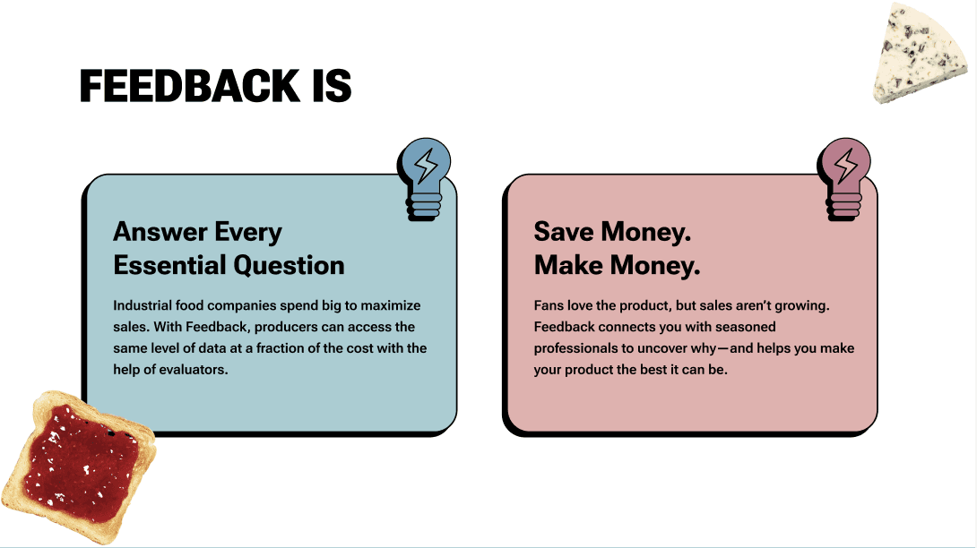
Hero Section: A striking cheese photo symbolized the link between producers and evaluators, set against a colorful, modern background. The high-contrast image improved visibility, and the text was sized for easy reading.
What’s in It for Producers & Evaluators: We created two clear sections, each designed for its audience. Bold icons, high contrast, and large text made navigation easy, especially for users with visual impairments.
Testimonial Section: Featuring real user reviews with large photos, this section added a personal touch. Oversized punctuation and big, readable text made the design playful yet accessible.
Process
and Collaboration
In Phase 6, we used user research and interviews to improve the wording and make the user flow smoother. With feedback from Figma and sticky notes, we refined every detail. I worked in sprints, presented my work to the client, and teamed up with my colleagues to ensure the designs met both user needs and client goals.
Design Solutions: We designed three main pages: the Homepage, Producer page, and Evaluator page. Each had its own look and purpose. We focused on making them both visually striking and easy to use for everyone. Here's how we approached each one:
Home Page
We designed a bold yet practical homepage that was simple, engaging, and easy to navigate. It introduced the core of the Feedback platform while guiding users to the right sections.
Hero Section: A striking cheese photo symbolized the link between producers and evaluators, set against a colorful, modern background. The high-contrast image improved visibility, and the text was sized for easy reading.
What’s in It for Producers & Evaluators: We created two clear sections, each designed for its audience. Bold icons, high contrast, and large text made navigation easy, especially for users with visual impairments.
Testimonial Section: Featuring real user reviews with large photos, this section added a personal touch. Oversized punctuation and big, readable text made the design playful yet accessible.
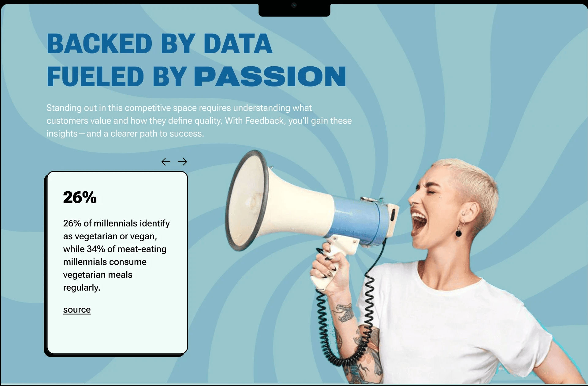
The Evaluator Page needed to feel different from the Producer Page while still fitting within the bold, punk aesthetic. The focus here was on usability, with a clear and engaging design.
Design: We used contrasting red and burgundy tones for this page to differentiate it from the Producer Page. While the colors were bold, we ensured they met accessibility standards by testing for color contrast and using easily readable fonts.
Fun Animations: To add a sense of depth, we used subtle animations that made the page feel dynamic, like text fading in and out when users scrolled. This added a playful touch without overwhelming the user, and we made sure the animations were not distracting or confusing.
Forms and CTAs: We simplified form fields, redrew icons for a more consistent look, and made sure that all forms were fully accessible, both in terms of keyboard navigation and screen reader compatibility. The forms were easy to navigate, with clearly labeled inputs and buttons.
Evaluator Page
The Producer Page had to align with the client’s punk-inspired, neo-brutalist style while ensuring accessibility for producers using the platform. Here’s how we achieved this balance:
Design: The page featured large, bold fonts with thick drop shadows to give it a strong, modern feel. While these design elements fit the punk aesthetic, we ensured that they didn’t sacrifice legibility. We tested font size, line spacing, and contrast to make sure the text was readable even with the bold design choices.
Imagery: To match the theme, we used playful, dynamic images of punk rock-style people and food, making the page feel engaging without overwhelming the content. We made sure the images were properly sized and used high-contrast borders around images to maintain accessibility for all users.
Tone & Language: The tone on this page was cheeky and fun, with pricing plans named "Snack," "Meal," and "Feast" to appeal to the playful nature of the design. This also helped break down the pricing structure into digestible chunks, making it more accessible to users with different levels of familiarity with food evaluation services.
Evaluator Page

Producer Page
Producer Page
The Producer Page had to align with the client’s punk-inspired, neo-brutalist style while ensuring accessibility for producers using the platform. Here’s how we achieved this balance:
Design: The page featured large, bold fonts with thick drop shadows to give it a strong, modern feel. While these design elements fit the punk aesthetic, we ensured that they didn’t sacrifice legibility. We tested font size, line spacing, and contrast to make sure the text was readable even with the bold design choices.
Imagery: To match the theme, we used playful, dynamic images of punk rock-style people and food, making the page feel engaging without overwhelming the content. We made sure the images were properly sized and used high-contrast borders around images to maintain accessibility for all users.
Tone & Language: The tone on this page was cheeky and fun, with pricing plans named "Snack," "Meal," and "Feast" to appeal to the playful nature of the design. This also helped break down the pricing structure into digestible chunks, making it more accessible to users with different levels of familiarity with food evaluation services.
Evaluator Page
The Evaluator Page needed to feel different from the Producer Page while still fitting within the bold, punk aesthetic. The focus here was on usability, with a clear and engaging design.
Design: We used contrasting red and burgundy tones for this page to differentiate it from the Producer Page. While the colors were bold, we ensured they met accessibility standards by testing for color contrast and using easily readable fonts.
Fun Animations: To add a sense of depth, we used subtle animations that made the page feel dynamic, like text fading in and out when users scrolled. This added a playful touch without overwhelming the user, and we made sure the animations were not distracting or confusing.
Forms and CTAs: We simplified form fields, redrew icons for a more consistent look, and made sure that all forms were fully accessible, both in terms of keyboard navigation and screen reader compatibility. The forms were easy to navigate, with clearly labeled inputs and buttons.
Home Page

Producer Page

Evaluator Page
Home Page
Producer Page
Evaluator Page
Home Page
Producer Page
Evaluator Page
Home Page
Producer Page
Evaluator Page
Home Page Prototype

Producer Page Prototype
Evaluator Page Prototype
Home Page Prototype
Producer Page Prototype
Evaluator Page Prototype
Home Page Prototype
Producer Page Prototype
Evaluator Page Prototype
Home Page Prototype
Producer Page Prototype
Evaluator Page Prototype
Outcomes and Results
Outcomes and Results
Outcomes and Results
While the designs were well-received, the project did not reach its final stage due to the client’s decision to change direction. Despite this setback, the project provided valuable learning experiences, particularly in balancing bold design with accessibility. We were able to create a visually engaging platform that adhered to accessibility standards and was easy to use for both food producers and evaluators.
Reflection and What I Learned
This project reinforced the importance of accessibility, particularly when working with bold design choices. I learned to advocate for users by pushing back on extreme design elements that might hinder usability. The collaboration with the team was a key takeaway, and the experience of iterating quickly based on client feedback allowed me to grow as a UX designer.
Key Takeaways
Accessibility is crucial: Designing with accessibility in mind doesn’t mean sacrificing creativity. Bold designs can be made accessible with the right attention to detail.
Collaboration and feedback: Working in a fast-paced, collaborative environment taught me how to iterate quickly and communicate effectively with both the client and the development team.
User-first mindset: Balancing the client’s preferences with user needs was a challenge, but it ultimately made the design process more rewarding.
This project allowed me to grow as a UX designer, balancing bold aesthetics with usability and accessibility, all while ensuring the design met the needs of users and the client’s vision.